Civ 7's Deluxe Edition launched just a day ago, and online discussions are already buzzing about its user interface (UI) and other shortcomings. But is the criticism justified? Let's delve into the game's UI elements and assess whether the internet's assessment is accurate.
← Return to Sid Meier's Civilization VII main article
Is Civ 7's UI as Bad as They Say?
Early adopters of Civ 7's Deluxe and Founder's Editions have already voiced concerns, particularly regarding the UI (and missing quality-of-life features). While it's easy to join the chorus of criticism, a more measured approach is warranted. Let's dissect the UI piece by piece and evaluate its effectiveness as a 4X interface.
What Makes a Good 4X UI?
Defining an "objectively good" 4X UI is tricky. The ideal design depends heavily on the game's context, style, and goals. However, UI/UX experts have identified common elements that contribute to effective 4X interfaces across various titles. Let's use these established principles to analyze Civ 7's UI.
Clear Information Hierarchy
A clear information hierarchy prioritizes accessibility and relevance. Frequently used resources and mechanics should be prominent, while less crucial features should be easily accessible with minimal clicks. A good UI doesn't display everything at once; it organizes information logically.
Against the Storm offers a strong example. Building info menus use multiple tabs to organize information by frequency of use, prioritizing essential actions while keeping less-used features readily available.
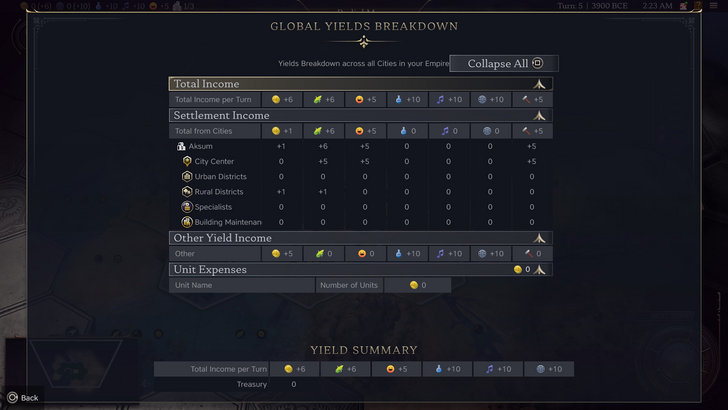
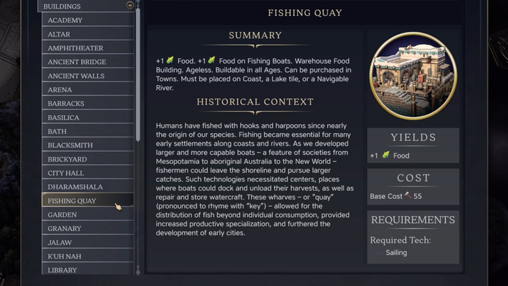
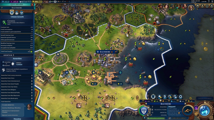
Let's examine Civ 7's resource summary UI. It effectively separates income, yields, and expenses via dropdown menus, providing city-by-city breakdowns. The collapsible table format is well-structured. However, it lacks granular detail. While total resource yields from rural districts are shown, the specific district or hex isn't identified. Expense breakdowns are also limited. While functional, improved specificity would significantly enhance its usability.
Effective and Efficient Visual Indicators
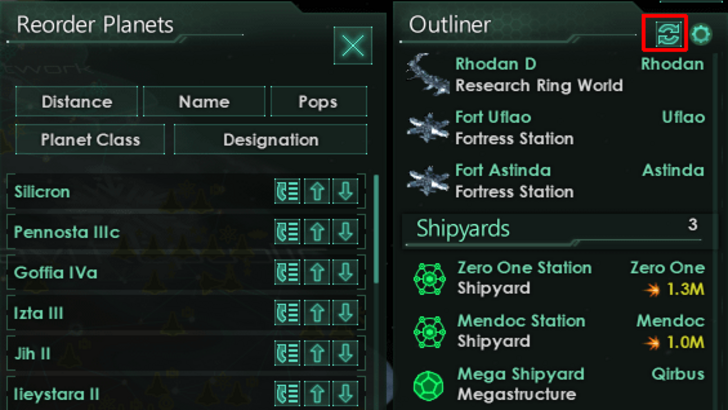
Effective visual indicators—icons, colors, overlays—convey information quickly and intuitively, minimizing reliance on text. Stellaris, despite its cluttered UI, uses visual indicators effectively in its Outliner to show ship status at a glance.
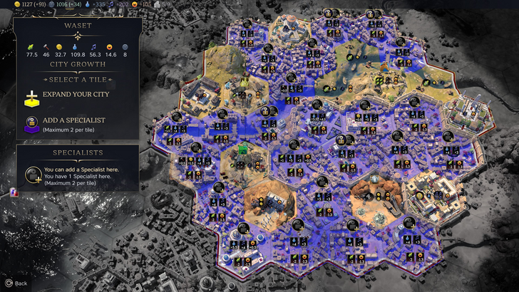
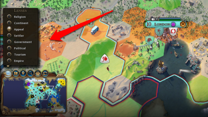
Civ 7 utilizes iconography and numerical data for resources. The tile yield overlay, settlement overlay, and settlement expansion screen are effective. However, the absence of certain lenses present in Civ 6 (e.g., appeal, tourism, loyalty) is a significant drawback, along with the lack of customizable map pins. While not disastrous, improvements are needed.
Searching, Filtering, and Sorting Options
As complexity increases, search, filter, and sort functionalities become crucial. Civ 6 excels here with its robust search function, allowing players to easily locate resources, units, and features on the map. Its integrated Civilopedia links entries to in-game elements.
Civ 7's absence of a comparable search function is a major shortcoming. This significantly impacts usability, especially considering the game's scale. The lack of this crucial feature is a notable weakness.
Design and Visual Consistency
UI design and visual consistency are paramount. A cohesive aesthetic enhances the overall player experience. Civ 6's vibrant, cartographical style seamlessly integrates with the game's visuals, creating a unified experience.
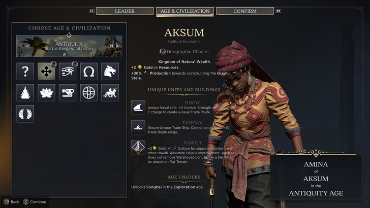
Civ 7 adopts a minimalist, sleek design. The color palette (black and gold) is elegant, but the overall aesthetic is less visually striking than Civ 6. This more subtle approach may not resonate with all players, leading to mixed reactions. Ultimately, visual preference is subjective.
So, What's the Verdict?
Not the Best, But Not as Bad as Claimed
While Civ 7's UI isn't perfect—particularly lacking a crucial search function—it's not as flawed as widely suggested. Compared to other issues, the UI shortcomings are relatively minor. While it falls short of some competitors in visual appeal and efficiency, it possesses strengths. Future updates incorporating player feedback can significantly improve its usability. The overall game's strengths largely compensate for the UI's imperfections.
← Return to Sid Meier's Civilization VII main article
Sid Meier's Civilization VII Similar Games